Background
The Balkans is a region with a rich history and diverse cultural heritage. Its history is marked by periods of indigenous development as well as occupation by external powers, including the Roman, Byzantine, and Ottoman empires. Each has left an imprint on the region's cultural fabric, from architecture and art to religion and language.
Following the Yugoslav Wars of the 1990s, the Balkan region experienced a significant population decrease due to mass emigration, internal displacement, and loss of life. The wars have contributed to enduring negative perceptions of the region, often overshadowing its rich cultural heritage that continues to thrive today.
Given these enduring perceptions, I chose to design a microsite that can present the Balkans in all its complexity to a global audience.
Research
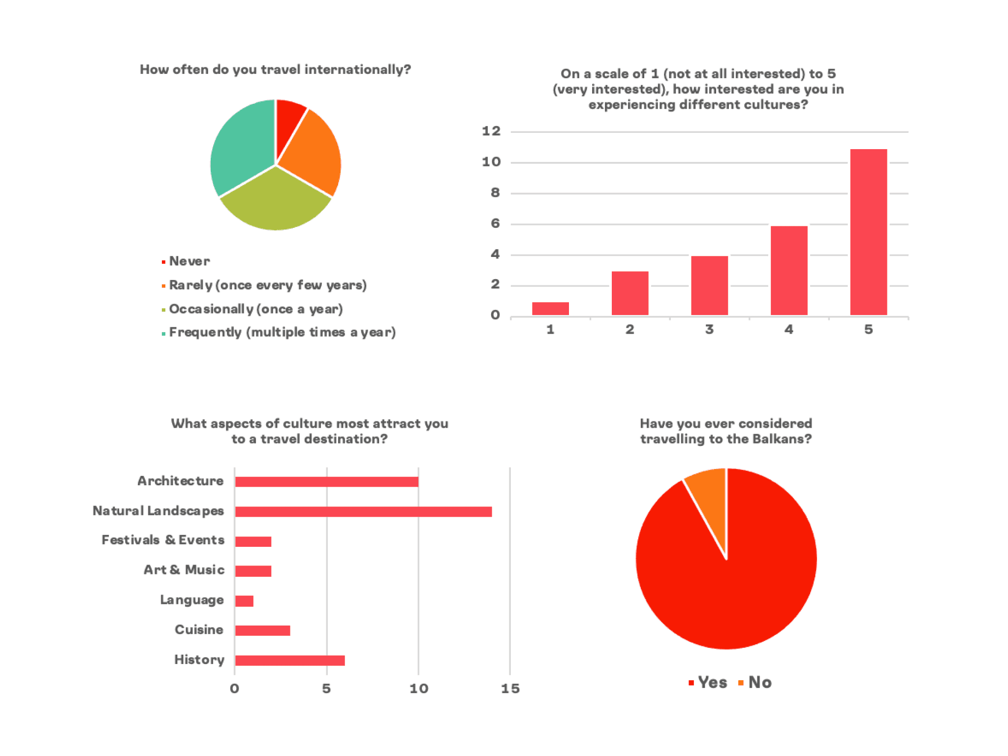
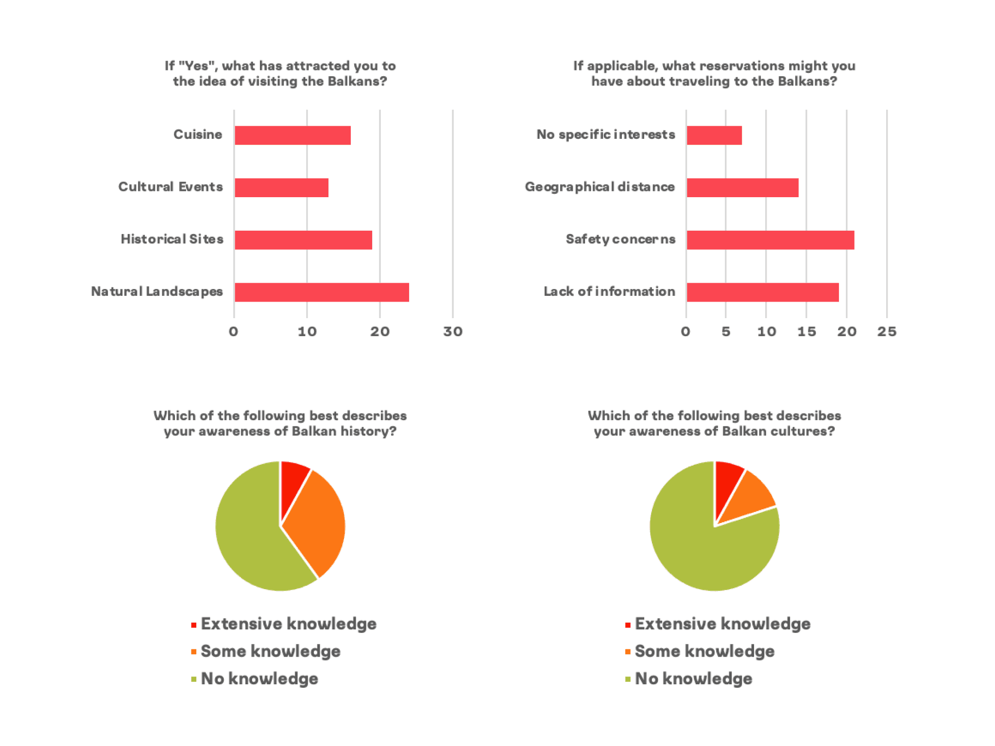
I began my research with a discovery survey distributed via social media.
I found that although there is a wide interest in visiting the Balkans, most people are unfamiliar with Balkan history and cultures, and report a lack of available information on the region as well as concerns about its safety.
To gather information on how to best present the Balkans with a microsite, I then conducted interviews with four people of Balkan heritage. I found that there's a strong desire for addressing misconceptions about Balkan cultures and an inclusion of narratives that go beyond historical conflict to celebrate the region's rich diversity and resilience.

Personas
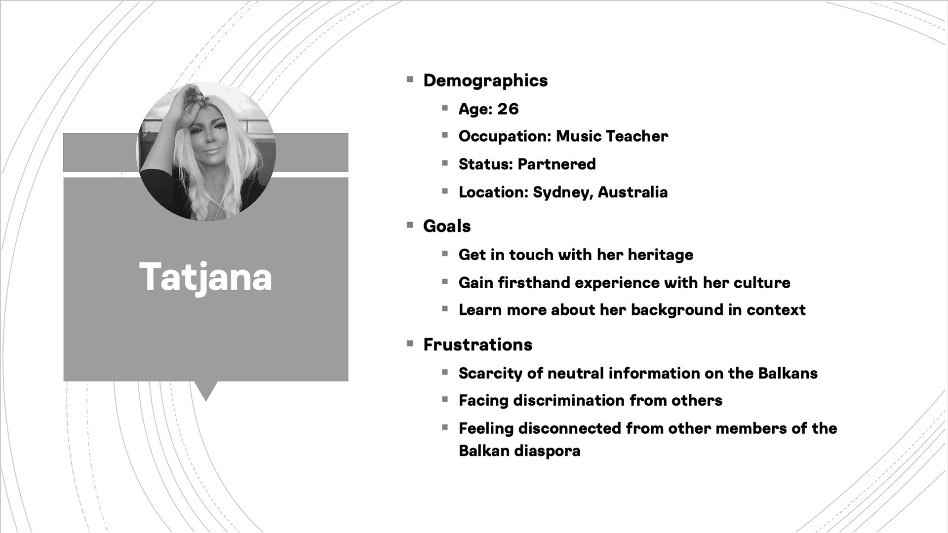
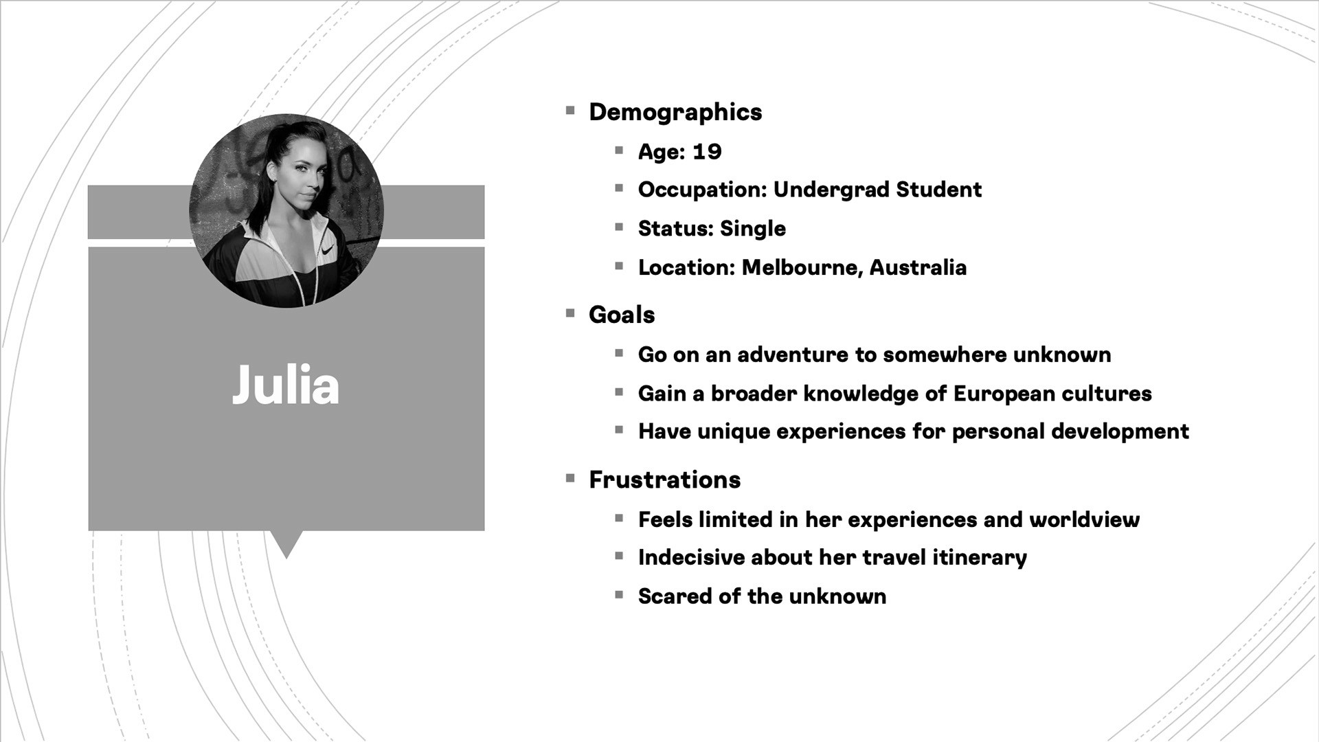
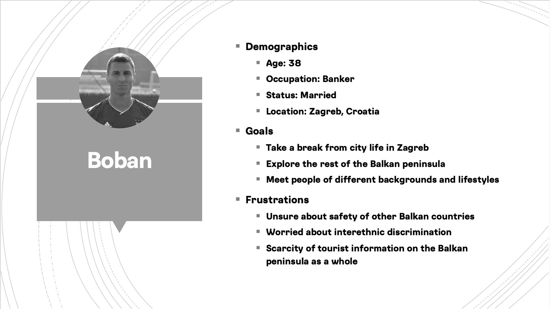
Once I had gathered enough data, I developed personas to get a high level understanding of some of the reasons different users would hesitate to travel to the Balkans.
To ensure inclusivity, I created three personas representing all of the different user groups that the microsite will be targeting. A few of the key areas included were: diversity in age groups, levels of income, exposure to different cultures, travelling experience, as well as distance from the Balkan peninsula.
Information Architecture
In line with these findings, I structured my microsite around geographic specificity, dividing the countries into individual pages under the larger umbrella of the Balkan region.
A main navigation bar includes links to the homepage and each country, with a drop-down menu for subsections. Additionally, the homepage contains links to each country's page. From the homepage, users can either delve into specific countries or download a travel brochure immediately.
Within each country page, users are given a holistic view of each destination. Standardised labelling is employed across all country pages to facilitate ease of navigation and enhance user experience.
Sketching
I then sketched a few designs to quickly conceptualise layouts for the microsite. My first iteration was inspired by the standard landing page, with flag icons serving as the main navigation.
The homepage is designed to engage users as soon as they land on the webpage. The hero section includes a call-to-action to highlight the purpose of the website. On the country pages, the section gives a brief overview of the country's highlights before the user delves into the content. This approach aims to quickly capture user interest and guide them towards meaningful interactions.
For the mobile layout, I added a hamburger menu with flag icons and country names. Additionally, I increased the image height in the carousel section of the country pages to improve readability on smaller screens.
Wireframes
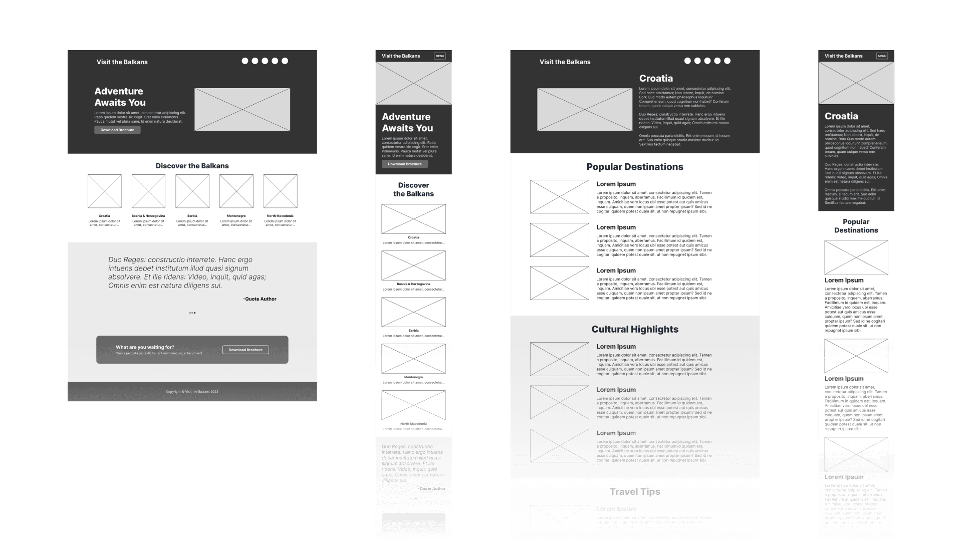
For my second iteration, I aimed to enhance user engagement and improve information hierarchy.
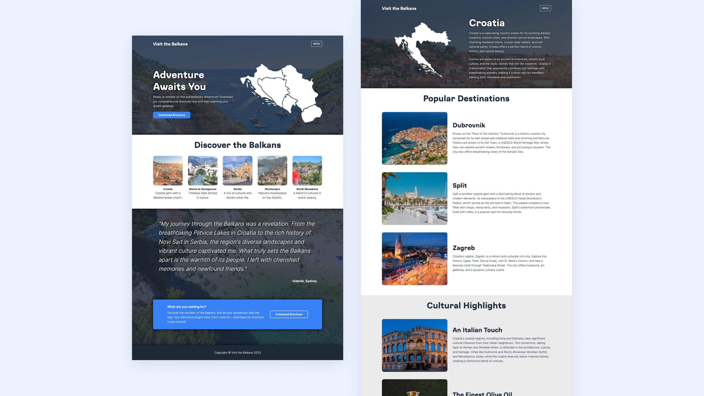
I changed the hero section on the homepage to feature an image preview of the brochure, so that users could have an immediate visual cue of what they would receive upon taking action, increasing the likelihood of engagement with the call-to-action. Additionally, I replaced the initial carousel with a grid layout to better categorise and display the featured countries, reducing cognitive load.
On the country pages, I added an image of the country's map outline to provide geographical context of the destination, thereby enriching the informational value of the page. I also added images to the popular destinations and cultural highlights sections to offer a visual complement to the textual descriptions, enhancing user engagement and providing a more immersive experience.
As with the first iteration of the mobile layout, I kept the hamburger menu and increased the height of the images in the featured countries section, as well as the box height of the final call-to-action.
User Testing
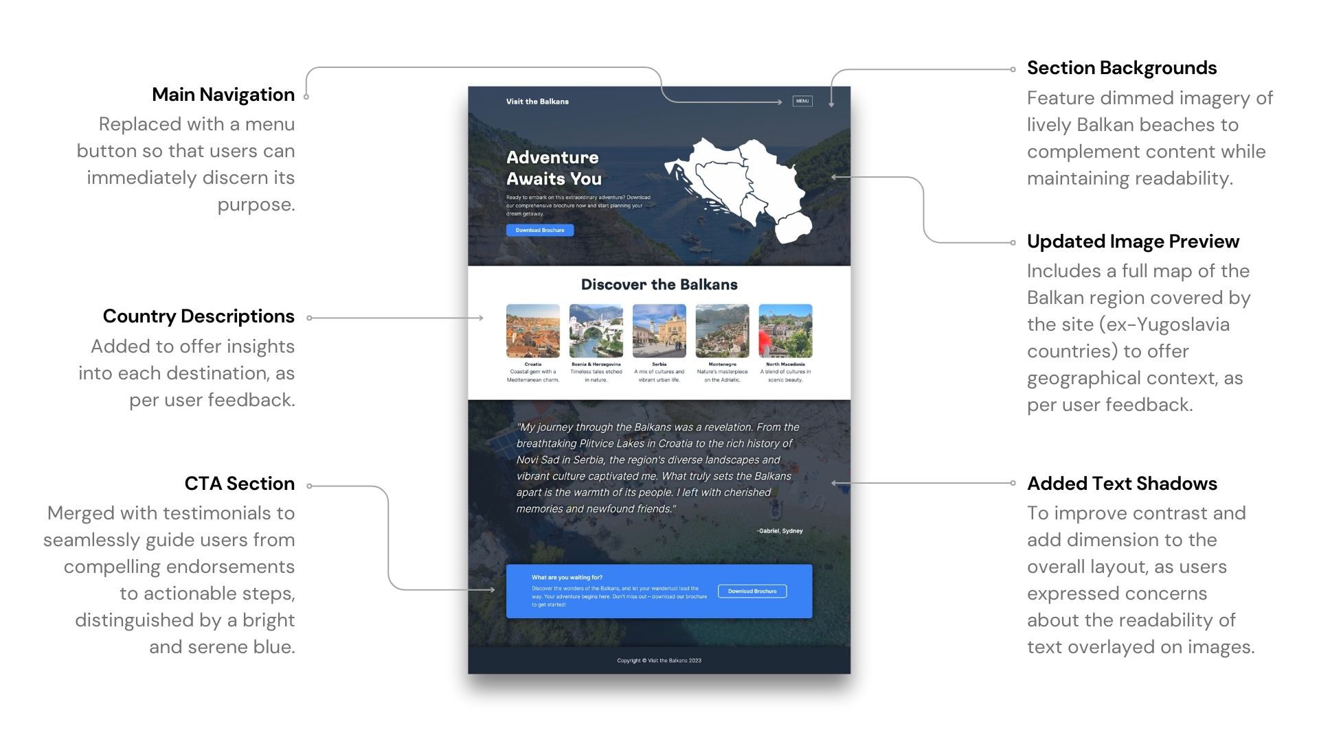
I conducted user testing with two other design students, who offered a range of suggestions regarding the website's design. One user proposed adding descriptions of the covered countries to the homepage, along with a map to display the proximity between countries to facilitate travel planning. To provide a more engaging experience, she advised replacing the checkmarks in the travel tips section with images to improve the design’s consistency.
The second user suggested adding country names below the flags in the navigation bar. Furthermore, she recommended adding an introductory section about the Balkan region as a whole on the homepage, to provide users with an overview of the region before navigating to specific country pages.
High-Fidelity Prototypes
The initial mockups served as a blueprint during the development phase, outlining the website's layout, contents, colour scheme, and typography. I made some minor adjustments during the prototype phase to improve usability, performance, and aesthetics.
Web Development
Finally, I developed the webpages with HTML, CSS, and JavaScript. I used flexbox rows and grids for the layout to create a responsive design that maintains its integrity across different screen sizes, affording adaptability and visual consistency across multiple devices.

Next Steps
There is a number of potential enhancements for future iterations:
Adding interactivity to the map of the Balkans on the homepage, as an additional means of navigation and to provide a more immersive user experience.
Improving the website content, such as adding links to external websites, to provide users with a more engaging platform and inspiring them to explore further. The website aims to be a valuable point of reference for users interested in travelling to the Balkans. More detailed, action-oriented content can also improve user engagement, increase returning visitors, and potentially lead to higher conversion rates.
You can view the live website by clicking here.
